Canvas
#F8F9FB The quiet foundation for a page.
INTERNAL & PARTNER USE
A clear, consistent expression of Sombra.
Visual identity, product language and the details that bring it together.
Current identity: Pause Medium. The artwork below matches the published website. Use these files for all new materials.
01 / COLOUR PALETTE
Use cool, pale surfaces and dark, readable text. Purple draws attention to the next action. Keep supporting colours purposeful and backgrounds quiet.
#F8F9FB The quiet foundation for a page.
#FFFFFF Cards, navigation and white sections.
#5145EE Primary actions, links and emphasis.
#EEF2FF Selected states and gentle highlights.
#182033 Headings and primary information.
#596477 Paragraphs and supporting copy.
#687386 Metadata and secondary labels.
#E4E7EE Subtle card edges and dividers.
Purple hover#4338CA
Subtle surface#F3F4F7
Strong border#D5DAE4
Purple border#DCDFFE
Pair a dark foreground with a soft fill and a visible label. Colour should never be the only way to understand a state.
Completed work and positive states.
#047857#ECFDF5#B9EAD7Context and informational states.
#1D4ED8#EFF6FF#BFDBFESomething that needs a closer look.
#92400E#FFFBEB#F5D9A502 / TYPOGRAPHY
The marketing site keeps its existing typeface and hierarchy. Outfit is geometric and approachable, with enough weight for a clear headline and enough space for the detail.
Outfit on Google FontsWebsite type and logo artwork are different. Outfit remains the typeface for headings and body copy. The Pause Medium wordmark is based on Outfit Medium with a custom, diagonally split S. It is supplied as outlined vector artwork, not editable text. Use the approved logo files; do not recreate it by typing “Sombra” in Outfit.
These ranges describe the existing marketing hierarchy, not a new type scale. Use 14–16px for compact supporting copy and 12–14px for metadata. Reflow long headings on small screens; do not shrink body copy to make it fit.
03 / UI & LAYOUT
Keep the site's layout, rounded forms and generous spacing. Create hierarchy with white and pale grey, fine borders and soft shadows, rather than alternating dark sections.
A solid purple primary action and a white secondary action. Keep pill-shaped buttons and an obvious keyboard focus state.
White on #5145EE. Hover #4338CA. Secondary border #D5DAE4. Radius 999px.
White cards sit gently above the page. Use a 1px border, a 16px radius and a restrained shadow. Avoid heavy glows and decorative gradients behind reading content.
Fill #FFFFFF · Border #E4E7EE
Typical card padding 24–32px
Centre content within a 1200px maximum width. Use at least 20px side gutters and typically 80px vertical section padding on desktop. Reduce spacing thoughtfully on mobile.
Card shadow: 0 2px 6px at 2% ink, plus 0 12px 30px at 4% ink. Floating panels: 0 16px 48px at 7% ink. Borders still define the edge.
Use solid text colours, not reduced opacity. Aim for at least 4.5:1 contrast for body text and 3:1 for large text. Focus uses a 3px purple outline with a 4px offset.
Navigation uses white at 92% opacity with a 16px backdrop blur. Chips are compact; buttons are pill-shaped. Respect reduced-motion preferences and never rely on animation to reveal essential information.
04 / PRODUCT LANGUAGE
Sombra is the product, always capitalised and never pluralised. Introduce the story in this order: the file note, the connected workflow, then the specialist teams behind it.
Turns a client meeting into an adviser-ready file note. The concrete starting point for a new adviser, not the end of the story.
File Note → Quick Review → Client Directory → Book of Business → Follow Through. Use “Platform” or “the connected adviser workflow”, not the former “Sombra Intelligence” name.
Specialist teams doing discrete jobs for the firm. Regulatory Watch is live. Describe additional teams as roadmap, not as a fleet already running.
“Your Regulatory Watch team” names an individual unit. “The Sombra Swarm” names the whole agent layer. Never “a Regulatory Watch swarm”.
Starter, Pro and Team. Free entry is 3 file notes, not a “Free” plan. Retire the old Practice and Firm self-serve names. Refer to current pricing for allowances and prices.
Sombra suggests. The adviser reviews, accepts and acts. Describe the job and the evidence, without implying autonomous advice or guaranteed compliance.
05 / BRAND VOICE
Sound like someone who has worked inside an Australian advice firm. Explain the job plainly, show why it matters and respect the reader's judgement.
From every client conversation to the next best action.
Credibility line: Built inside Australian advisory firms · Designed for AFSL compliance.
06 / PARTNER BRANDING
The marketing site's “Powered by Claude” badge identifies the AI provider without competing with Sombra. Keep it secondary to our own identity.
Pale canvas · Fine border · Terracotta dot #D97757
Use “Powered by Claude” as attribution, not as a Sombra product name or a claim of endorsement. The dot is our existing decorative treatment, not an official Claude logomark.
For new partner materials or official third-party marks, check the brand owner's current assets and usage guidance. Do not recreate their marks or imply Sombra is an Anthropic product.
07 / LOGO & DOWNLOADS
Our current wordmark pairs medium-weight lettering with a custom S and its diagonal pause. The website uses the wordmark on its own, without a separate icon beside it. These are the same vector masters used in the published header and footer.
SVG masters, transparent PNGs up to 4800px, light, dark and purple icons, favicons, and an offline preview with usage guidance.

The published light-mode website wordmark.
#000019 · Transparent SVG Download midnight SVG 

For monochrome layouts and print artwork.
#000000 · Transparent SVG Download black SVG Need pure white rather than ivory? Download the white wordmark SVG. All colour variants share the same shapes and spacing.
Use the standalone symbol for app icons, avatars and compact placements. Icon files have square, full-bleed backgrounds; let the destination apply its own corner mask.
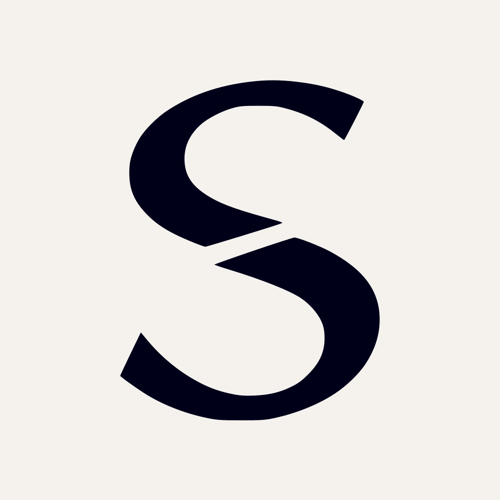
Midnight S on ivory.
Download light icon SVG
Ivory S on midnight. Used for the website tab and touch icon.
Download dark icon SVG
Ivory S on the asset kit’s #7C7AFF purple.
Download purple icon SVGArtwork colours are fixed. Midnight #000019, ivory #F5F2EE and icon purple #7C7AFF belong to the logo kit. The interface uses #5145EE for actions and links. Keep those roles distinct; do not recolour the supplied logo to match a button.
Leave clear space of at least one-quarter of the S height around the artwork. Preserve the aspect ratio, curves, letter spacing and diagonal pause. Do not add gradients, shadows or outlines.
Use the full wordmark at about 140 CSS px or wider. The current website uses 140px in the header and 168px in the footer. Choose SVG for sharp rendering at any size, or a PNG at least twice its displayed width.
The kit includes an optical S with a slightly wider pause for 16–64px browser icons, plus ICO, Apple and Android assets. Use those files at small sizes, not a reduced full wordmark. Dark, light and purple sets are included.
Pause Medium replaces the earlier Pause exports and icon-plus-text lockup. Earlier concepts are archived, not alternative current logos. Use this kit as the source for new materials.
